The aristocratic color palette: how to build a discreet, refined interior
Aristocratic style is not a seasonal trend but a visual language shaped by decades of understated elegance, passed down through family homes and European estates. What draws the eye is never a loud color, but the balance between warm, natural tones and noble materials. A well-built aristocratic palette reads instantly: it feels as though it has always been there, rather than deliberately chosen. The secret lies in how you combine warm beige, olive green, deep bordeaux and noble neutrals with solid wood, velvet and aged brass — without leaving room for chromatic accidents. To understand the full philosophy behind this style, the article on aristocratic style in interior design explains the core principles the color palette puts into practice.
Warm beige and cream — the foundation of every aristocratic interior
Every aristocratic palette starts from a warm neutral base: beige, cream, ivory, sand. These tones reflect natural light beautifully and let textures — wood, wool, linen — take center stage without overwhelming the room. On walls, a soft warm beige or a creamy warm white acts as the canvas for the rest of the palette. It's essential to avoid cool neutrals with a grey-blue undertone, which cut straight through the warmth the style depends on. A living room built around this base, completed with pieces from the living room furniture collection, instantly gains that sense of quiet, lasting comfort.
Olive green and English bottle green
Olive, forest and English bottle green are the "accumulated" colors aristocratic style has always worn — from panelled libraries to velvet armchairs in drawing rooms. They work beautifully on a sofa, heavy curtains, or an accent wall behind a bookcase. Olive has a practical advantage: it pairs naturally with both walnut and oak, never clashing. If you want to introduce this tone without risk, the safest route is an armchair or a pair of cushions — you'll find concrete ideas for combining textures in the article on premium upholstery in velvet, linen and natural leather.
Bordeaux, garnet and deep red accents
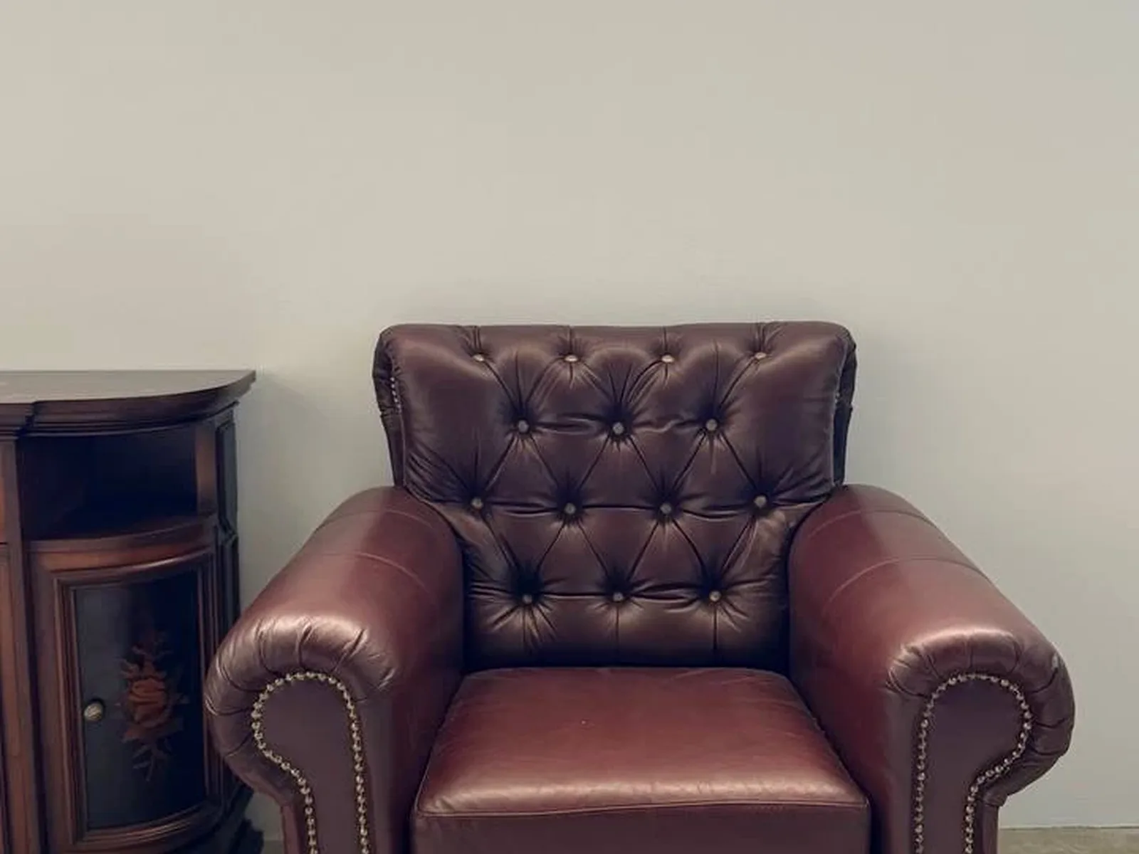
Bordeaux (or garnet) is the statement color of the aristocratic palette, used sparingly — in a rug, a leather-bound book, or a decorative vase. It never covers large surfaces; instead it slips into details: a cushion, a lamp, a frame. Paired with cherry or walnut wood and aged brass, bordeaux gains the depth of an authentic English drawing room without feeling heavy. It's exactly the kind of accent found in the decorative pieces selected for the article on choosing artwork for an aristocratic interior, where the color of a frame or a canvas converses with the rest of the room.
Navy, warm grey and stone tones
For balance, the aristocratic palette often turns to navy blue and warm grey, almost melting into beige — a natural stone tone. Navy works impeccably in a study or library, on shelving or a Chesterfield armchair, while warm greys appear on walls or rugs as a discreet backdrop for furniture. These colors never compete with solid wood — they let it remain the protagonist, exactly the role wood plays in every genuine aristocratic interior.
How to pair the color palette with solid wood
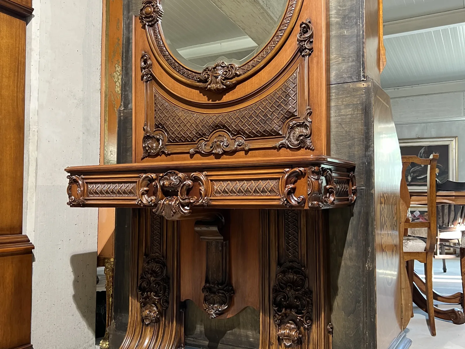
Aristocratic color doesn't exist apart from material — it's built around wood species. Walnut, with its chocolate-red tone, calls for warm colors: beige, bordeaux, olive green. Oak, lighter and golden, pairs beautifully with cream, navy and bottle green. Cherry, with its refined reddish hue, harmonizes elegantly with garnet and noble neutrals. If you're unsure which species suits you, the article walnut, oak or cherry — how to choose your wood species helps you start from the wood and move toward color, rather than the other way around. At the Martello showroom in Nimoreni, Ialoveni (just 15 minutes from Chișinău), you can see firsthand how each species reacts to natural and artificial light before deciding on wall or textile colors.
One-of-a-kind pieces: how they bring authenticity to your palette
A well-considered aristocratic palette needs genuinely rare pieces, not mass-produced reproductions. At Martello we select furniture and decorative objects in solid wood, brass, marble and natural leather — one-of-a-kind pieces, curated for their rarity and their story. Once sold, a piece from the Martello collection is never repeated, which means your interior gains a character that is difficult to copy. Explore the full Martello catalog to find the pieces that complete exactly the tones you've chosen — from a deep walnut chest of drawers to an armchair upholstered in olive velvet.
Common mistakes to avoid
The most common mistake is treating aristocratic style as maximalist, with color on every surface. In fact, the strength of this palette lies in restraint: two or three base tones, one accent of bordeaux or green, and the rest left to wood and texture. The second mistake is mixing undertones — a warm beige next to a cool grey instantly breaks the harmony. The third is ignoring the room's natural light, which can radically change how a color reads throughout the day.
A successful aristocratic palette never feels forced. It's built slowly, piece by piece, color by color, with the patience of an interior that has time on its side — exactly the philosophy behind every piece we add to the Martello collection.